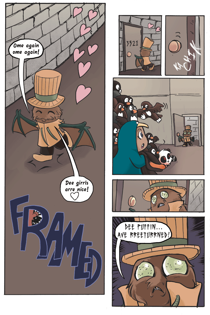
Framed01
HAPPY FRIDAY THE 13TH! Don’t let bad luck eat your face. : )
So this Chapter is going to be interesting. I’m doing full colors again, and for the first time since college, digital lettering.
Normally I hand letter everything, because I do not think digital lettering looks appealing with my art. Mostly because I’m strange head when it comes to fonts. It boils down to me just not liking the looks of some letters in font. The letters I and L in particular since in some fonts they look too much a like to me. My last project for school I did try lettering with a font I think called Anime Ace. I wasn’t too fond of it. All caps felt like everything was yelling.
Just because I’m not fond of something doesn’t mean that I can’t consider it’s benefits. and I won’t argue, changing the kerning and spacing with out having to cut and paste sounds like a very big time saver. Hearing “once you find a font you like” persuaded me too.
Trying new things and being open sounds like a good mindset for me. So LETS SEE HOW THIS GOES.


Good luck!
The puffin? Wow!